Beyond the Ladder
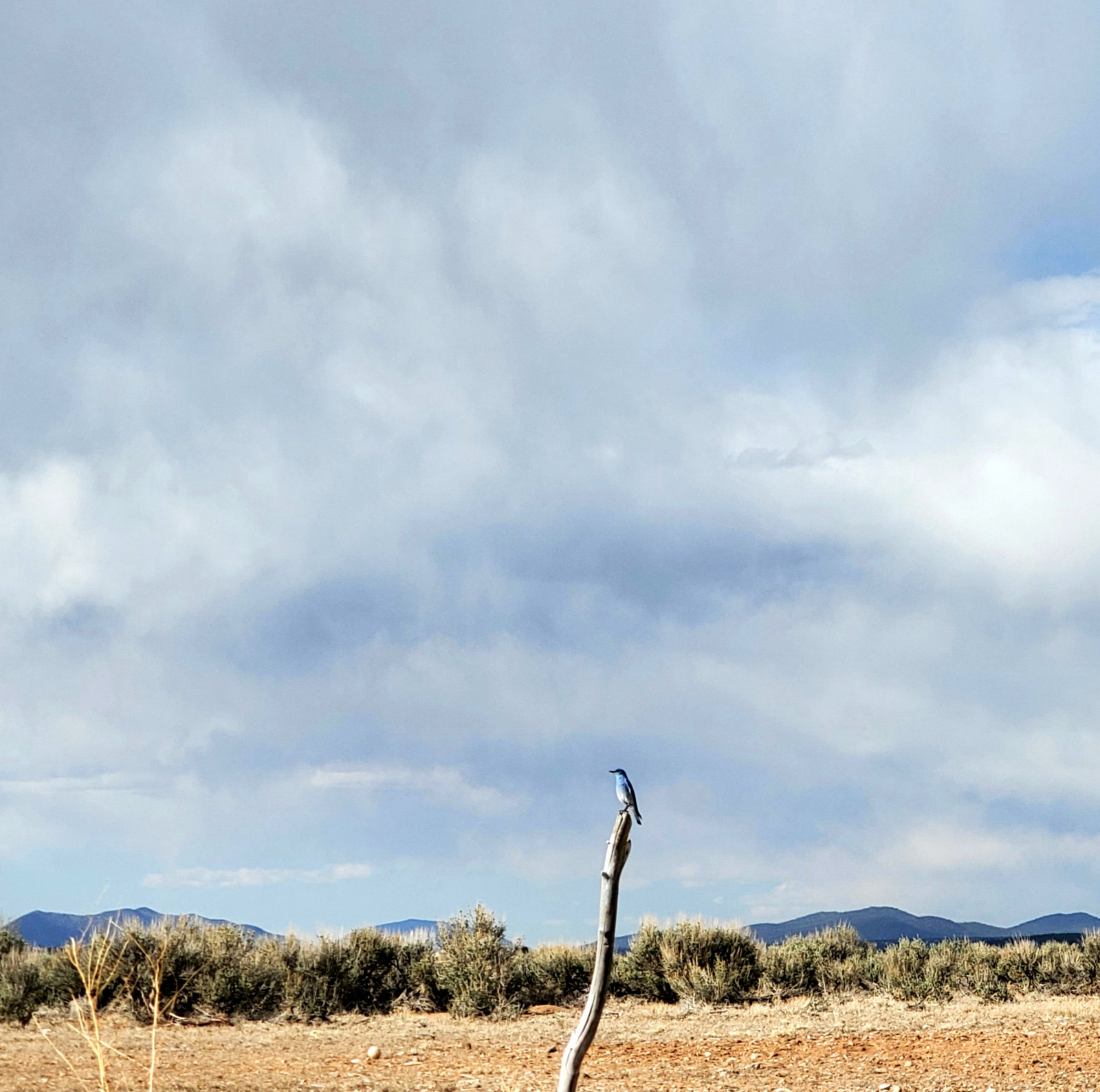
Over the past few years we have grown up significantly and are emerging from the pandemic like a mountain bluebird ready to fly the nest. This level of evolution felt like the right time to rebrand ourselves with a new logo and image that speaks more intimately to who we are and the principles upon which our mission and ethos are found.
Ever since we first started Heritage Inspirations it has been evolving and growing, from an idea to New Mexico’s premier travel company. HI was born in 2015 as a branch of Heritage Hotels & Resorts and their look informed much of our image and style at first. Over the past few years we have grown up significantly and are emerging from the pandemic like a mountain bluebird ready to fly the nest. This level of evolution felt like the right time to rebrand ourselves with a new logo and image that speaks more intimately to who we are and the principles upon which our mission and ethos are found. So I reached out to my long time friend and confidant, Kristin Mora to help me create our new look.
I have been working with Kristin for over a decade now and we make a great team. When we met, Kristin was an advisor for my creative writing and photography. Our first project was creating a website and logo for Inspire Handmade Cards by Angelisa. When I began Inspired by Angelisa, the logo was so important to me. I envisioned an old-fashioned wax stamp on every handmade card etched with my handwriting and she quickly brought the story to life. That is one thing about our colloquialism; if I share a thought or idea with Kristin, she is always able to capture the essence and our visions are aligned effortlessly. Our partnership has lasted and strengthened over the years. Kristin has been an integral and aligned inspiration to me as we bring forth the authenticity and passion of HI through her creative design. When we first met, Kristin was also an advisor on my handwriting which is now one of the elements in our new logo. The “inspirations” literally looks like my handwriting. When I shared the logo with close friends, they could see how Kristin had integrated that personal touch that is now woven into our identity.
“These rich images have always been the focus of the design work because they tell the stories of the incredibly unique, vibrant, immersive experiences curated by HI.”
Since the very beginning of HI, we produced stellar photography of our tours, images rich with sunlight and landscape, cultural patterns and textures, rugged hard-to-reach places off the beaten path. Kristin explains, “These rich images have always been the focus of the design work because they tell the stories of the incredibly unique, vibrant, immersive experiences curated by HI.”
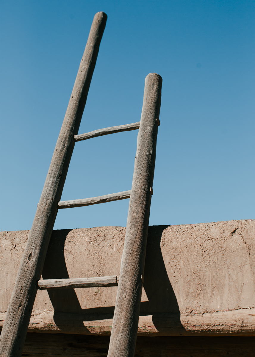
The inspiration for these designs was based on two images that we use often, the ladder image and the Chaco lense flare image. Kristen explains, “I tried many illustrations of the ladder, but landed on this one based on a photo from Taos Pueblo captured on one of our tours. I reduced the number of rungs to 5 to represent the 5 elements.” Climbing each rung is an invitation to travel across New Mexico’s elements on any of our tours.
The next challenge was to create a horizon for the ladder to lean on because it didn’t make sense for the ladder to lean on the sun… there needed to be a horizon line to support it to create the depth and perspective representative of journey, our journey and the journeys of our guests.
Then there was the challenge of creating the New Mexico sun and it’s bright light using a black stroke. She chose paint strokes because it creates a glow effect and a feel of the movement of light.
Then she experimented with the lens flare, which was challenging as most depictions of this light phenomenon rely heavily on transparency and gradients but she wanted to keep the logo one color. So it became a practice of distilling the lens flare down to its basic shapes using paint strokes, line weight and texture to create the idea of light and its transparency, but more focused on the fractal phenomenon that occurs, a very minimal approach to the lens flare and the architecture of the light, thinking of how a lens flare might be depicted in a petroglyph sense. In favor of simplicity, Kristin distilled down even further to highlight the three main elements; the sun, horizon, and ladder.
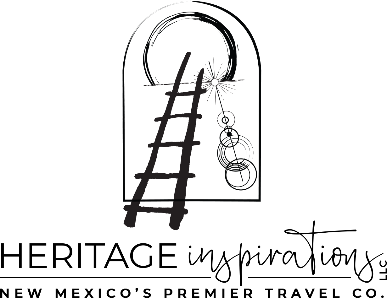
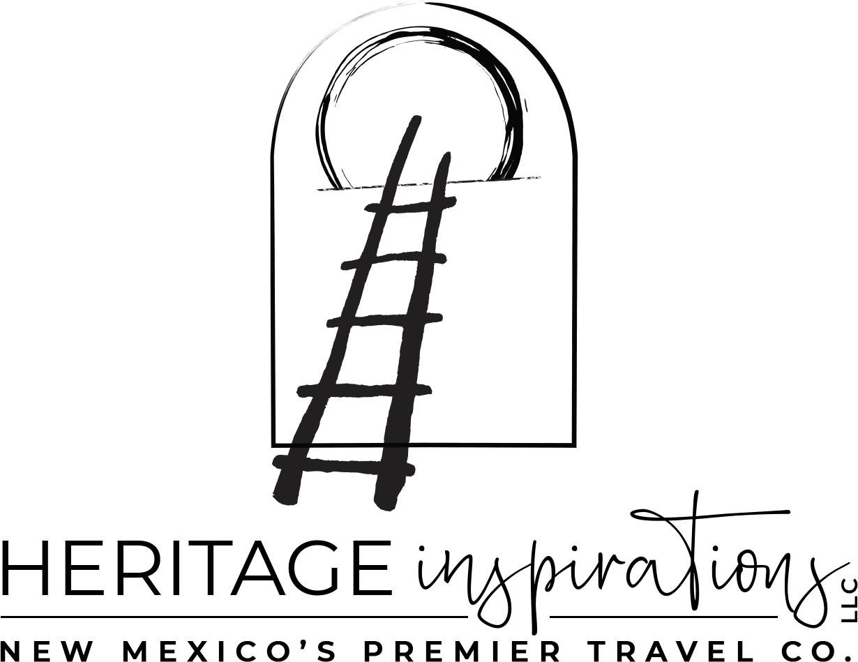
In addition to graphic design, Kristin also does the web design work for our site. This year we reorganized our tours into the 6 experience pillars that we shared with you earlier this year: Adventure, Glamp, Immerse, E-Bike, Wellness, and Family. Kristin brought these pillars to life on our website, just how we imagined it!
Stay tuned as we mindfully craft new merchandise with our new logo, so that you can be the first to take home a piece of our authentic story.


Angelisa, What a beautiful way to start a Sunday morning…I can’t imagine anyone NOT being inspired by you and what you have created…
It keeps me going knowing that soon I will be able to travel again to New Mexico and be on one of your tours…Hopefully this will happen in Sept 2021…until then my best wishes go out to you and to your ongoing success…Pat
It’s so inspiring to read your note and the contagiousness to our story calling you back to New Mexico again soon! We can’t wait to see you and greatly appreciate your encouragement and support!
Great story! This is a terrific moment in history to reboot your brand. The clarity of your mission shines now more than ever. Collaboration like this is such a blessing. May you have many, many years of continued success!
Cheers,
Peter
Thank you so much Peter for your warm sentiments, we are so honored to aligning our brand with our mission as we emerge into this new opportunity. Your words and support are cherished!
This means so much to us! Blessings! Angelisa
Angelisa:
Excellent design! I do like the version with the sun flare—which reminded me of the Transcendentalists, led by New Mexico’s own Raymond Jonson—but the version without it is elegant, elemental and speaks volumes.